For this
project the brief was ‘Interaction within Art and Design’. As this is very broad
subject, I could chose practically anything for the theme to my final piece, (as
long as my audience could interact with it in some way). I found it quite hard
at first to think of a theme, but I eventually decided on ‘Family’.
I had many different ideas, but my heart was set on painting as I haven’t had
many opportunities, within my college work, to sit down and really get stuck in to a detailed painting.
My first idea was to create
portraits of each person in my family and to hang an object that associated
them underneath. My ideas changed as the project went on and I finally decided
to keep the theme of portraits but instead of my whole family, I would only
paint my grandparents. I would make four portraits, two of my nan and two of my
granddad.
One would be from before they met and when they where my age, 18.


And the others will be a more recent image from their 50th wedding anniversary a few years ago.


Granddad


I am very pleased with how these two paintings have turned out. I particularly like the older image as the younger one was very hard to do. This is because the images I was working off was in black and white and the quality was very poor. But for what I had I think I made a good job.
Nan


Again I like the older images best as I had a clearer image to work off. The younger portrait of my nan was most defiantly the hardest one to do. I blame this on the photograph I had and the amount of 'guess work' I had to do.
The next stage was to develop the interaction.
Not long ago, I found my granddad’s old family movies. After watching them all and finding them so charming, I wanted to involve them in my work. I was quite difficult as each movie was on a separate film/reel that only lasted five minutes maximum and had to be played on an old, manual projector. Because of this, I had to convert them to a digital format so they could be played on computer and through a digital projector. This way it was easier for them to be played in the exhibition. The movie is about 20 minutes long so here here are just few clips from it.
Not long ago, I found my granddad’s old family movies. After watching them all and finding them so charming, I wanted to involve them in my work. I was quite difficult as each movie was on a separate film/reel that only lasted five minutes maximum and had to be played on an old, manual projector. Because of this, I had to convert them to a digital format so they could be played on computer and through a digital projector. This way it was easier for them to be played in the exhibition. The movie is about 20 minutes long so here here are just few clips from it.
To complete my piece, I started
thinking of ways to link everything together. I settled on making my final
piece an installation which would represent my nan and granddad’s living room.
I would bring in old furniture and different objects that I associated with them.
I would have the living room set out and split into two and with two chairs, turned inwards, where the two recent portraits will balance on
them with all the objects scattered around, like they were when I found them in
the house.
The Objects


The two younger images will be hung on the wall facing out wards
behind the chairs and the family movies projected in the middle.
Granddad


I will also add a walking stick remote-control and hat, also the mug will be filled with tea.
Nan

I will also add a silk scarf and fill the mug with tea.
My audience will be seated
facing the installation so they can watch the movie. They will also be able to
help themselves to a glass of white or black pop, (lemonade or dandelion and burdock)
which will be on a table by where the audience sit. This is because these are the
drinks my grandparents always offer me when I visit, they still get it
delivered from the ‘Pop Man’ in glass bottles.
To add a finishing touch I will
place a book on the table so my audience can write down comments and thoughts
about my work but most importantly, their own family memories of their
grandparents.
Overall, my final piece has changed enormously throughout the project, but I am very pleased with what I have finally achieved.
Overall, my final piece has changed enormously throughout the project, but I am very pleased with what I have finally achieved.
Another part of the brief was to learn how to sell your own artwork. So I picked
three of my own pieces that I think would sell the best.
1. My Fine Art final piece – This is a large painting I created, it was a transcription from one of the entrees in the John Moores Competition.
2. Observation final piece – This consists of three photographs that I over painted. Arnulf Rainer inspired.
3. Ceramic Ribcage piece - This was one of my experiments for the Multidisciplinary project. It turned out nicely and I think it would sell quickly.
The Exhibition
Tuesday 29th May 2012


On the Audience table I had a comment book with a note on that read:
'Please take a moment to write down any comments you have about my work.
Also feel free to share any on your favourite family memories.'


To show how my audience sit to watch/look at my installation.
 The older portraits and their objects...

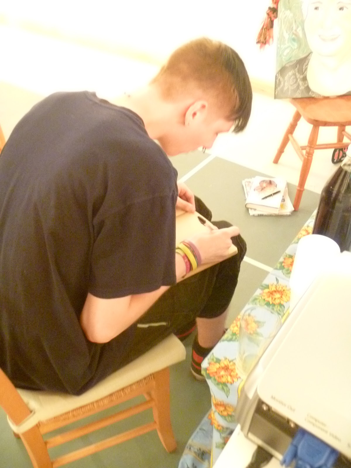
 Writing in my Comment book...
 Each side of the installation...


Tuesday 29th May 2012
So the exhibition was amazing!!
Once everyone's work was up it looked brilliant and very professional.I am super pleased with how mine turned out.
On the Monday we all went to set up so the majority of it was complete before Tuesday.
Setting Up
On the Monday we all went to set up so the majority of it was complete before Tuesday.
Setting Up
Here is the basic layout of my installation....
Before the two younger portraits where hung up


Objects
The Layout of the objects


Hehe I though this was hilarious when saw it !!


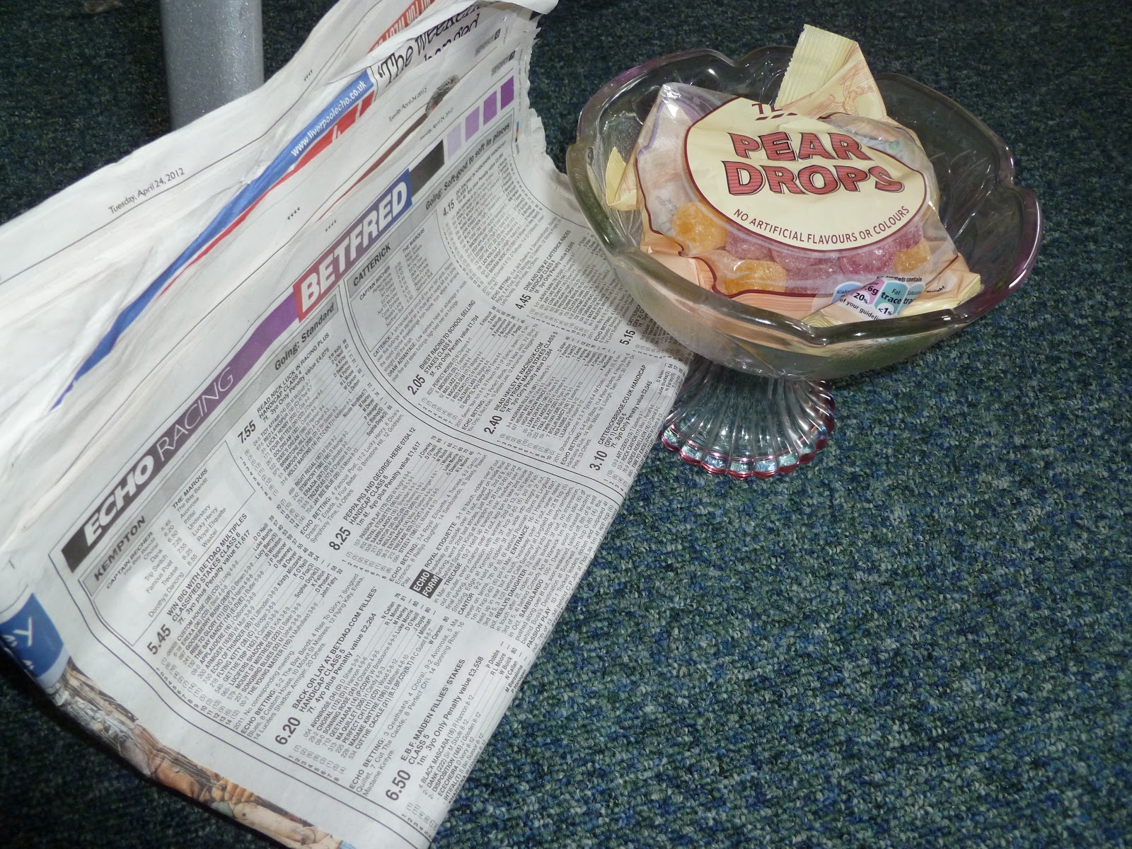
Table for the audience...
This shows the bottles of pop, the sweet bowl, the comment book and most importantly the projector.


On the Audience table I had a comment book with a note on that read:
'Please take a moment to write down any comments you have about my work.
Also feel free to share any on your favourite family memories.'


To show how my audience sit to watch/look at my installation.


The Projection
It was very hard to capture the projection on camera as I only had my little digital camera instead of my SLR but this was the best I could do. I think you can get a good idea of how it all worked from the images I have taken.

Overall I am extremely pleased with how my work has turned out, and even thought you can't get the full atmosphere from the images I have taken I hope you can see how my ideas have worked out.
This whole installation was a complete surprise to my family, especially my Nan, and she was thrilled by it. She even shed a little tear...
Artist Comment
Name: Salli-Louise Johnson
Title: Grandparents
Statement: Since being in college I have discovered the art of installation and wished to explore this within this project. My family have been on of my biggest inspirations of late, so I have focused all of my ideas around my Grandparents. Later this year I will be attending the University of Falmouth to pursue a BA Honours in Fine Art.
Exhibition Videos
I took these so you could see how the projection worked but my silly camera couldn't focus, it also had some troubles with the lighting. This is because my area was quite dark so my audience could see the movie projection, but had spot lights on my paintings so they could see the portraits just as clear. I thought it might be a nice idea to show you them anyway as you can see people writing in my comment book.


